

What do the colors in my dashboard mean?
Demographic columns (Gray)
In your involve.ai dashboard, gray fields display demographic information - attributes that help you filter customers and allows our AI to identify patterns and cohorts. While important, demographic data does not typically imply anything about your customers’ health.
KPI Columns (Red, Green, Gold)
To the right of these gray columns, you will encounter green, gold, and red fields. These colorful columns are Key Performance Indicators (KPIs) containing data that does impact customer health.
The colors provide an at-a-glance indication of whether each KPI is raising or lowering the customer’s health.
- Green = Positive impact / raising the health score
- Gold = Little or no impact to health score
- Red = Negative impact / lowering the health score
Customer Health score column (Red, Green, Orange)
To the farthest right is the Customer Health Score column. The fields in this column contain a green-, red-, or orange-colored bar and +/- percentage.
The color of the bar provides an at-a-glance indication whether the customer is healthy (green), neutral (orange) or red (at risk of churning). The color of the percentage tells you whether the score has gone up (green) or down (red) since the previous period.
How should I use the color coding?
Imagine the below is an image of your dashboard, and General Motors and Amazon.com are your customers (congratulations!). To the right of each customer are two columns that you know from the gray are demographic data, neither of which impact the health score. Further right, you see Product Usage and Interaction Frequency. You know immediately from the coloring that these do have the ability to impact the customers’ health.
In this example, by taking a quick look at the coloring of the involve.ai Customer Health column you can ascertain that General Motors is languishing (orange) and moving in a negative direction (red percentage), while Amazon.com is quite happy (green) and moving in a positive direction (green percentage).
By glancing back at the KPI fields, you can see from the red that Product Usage is a likely culprit for GM’s waning health. If you’d like to dig into why, you can toggle on the Detailed View (in the upper right corner of the dashboard screen) to see which specific metrics are causing the negative impact and score.
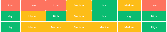
How do the colors correspond to the High, Medium, and Low values?
While the coloring and values are correlated, they do not mean the same thing, and are not intrinsically tied together. For details about how involve.ai produces the High, Medium, and Low values and what they mean, read this article about Normalization.